You are here

Intranet homepage review and benchmark

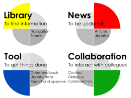
The intranet homepage is a vital part of your intranet: The first page for all users - the only page for some. So it is very crucial how you prioritize the limited space.

Four basic purposes
Mads Richard has developed a method for homepage review and benchmark showing how you use the space on your intranet homepage in relation to four basic purposes of a modern intranet:

  • Yellow: Find information (library)
  • Red: Be updated (news)
  • Green: Interact with colleagues (collaboration)
  • Blue: Get things done (tool)


Two graphs
As part of the activities in Intra2 | Share, Mads Richard assessed and presented the result via two graphs:

  • A pie chart, showing the balance between the four purposes
  • A bar chart, showing how your homepage compares against an average intranet homepage


The graphs can be used for evaluating and discussing an intranet homepage in relation to the general purpose of the intranet and the needs of the users. 

Want to know more?
You can learn more about intranet homepage review and benchmark by contacting Mads Richard or by reading this presentation on slideshare.


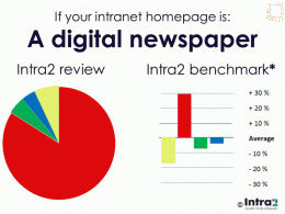
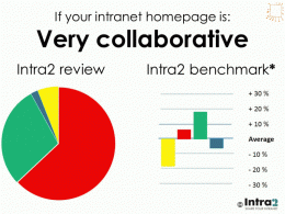
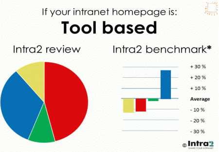
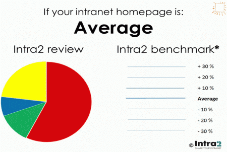
* Average use of space on intranet homepages, based on more than 200 reviews.